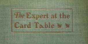
Jack Shalom wrote:Applying Occam's razor, any chance the italicized a is simply the result of having run out of the regular ones?
Jack, see the image below. Note that the 'a' slants the wrong way; not only that, but its width is appreciably exaggerated compared to the other type (especially the letters in the italicized 'The'). Just my opinion, but it sure seems the use of this very odd 'a' was purposeful, not the result of lack of type or carelessness.
And on that note … Tom!! Good to see you weighing in, my friend. We posted in the wee hours not ten minutes apart, and I didn’t see your post until now. I haven’t examined the lettering on the front cover of the book, but found your comments about the typographical asymmetry of the lettering very interesting. Your notes about how the cover art was created and manufactured seem spot-on. I too am unclear about the relevance of kerning and Gutenberg to the Erdnase book, but have to acknowledge Bill M’s researching prowess and in doing so might as well take a last poke at this off-the-deep-end topic. So ….
Bill, I read the Gutenberg section of Han The Thanh’s dissertation that you kindly dug up (much of the rest of the paper was highly technical and over my head). Alas, I’ve read enough cock-eyed theories and conclusions in academic papers on magic history and the law to retain a healthy skepticism of Thanh’s claims, BUT they do indeed support the view I was discrediting. Unfortunately, among his many citations to authority in his paper, Thanh offers
nada as authority to support his claims (relevant parts of which are quoted below), and even more curiously, appears to fundamentally undermine his claims by acknowledging that such micro-typography was practically negligible.
The second method to adjust lines was the use of multiple variants of glyphs for some letters … a letter in his composition could be typeset using several variants of a glyph with different width, depending on the requirements of typesetting a line. The main intention of use of multiple glyphs was most likely to achieve the constant distance between the vertical strokes of characters. The compositor therefore could select the glyph of a letter that seemed to be the best variant according to the position of the letter in the word or the line. … However, this seems to be a minor effect.
So I’m reluctant to regard Thanh as any sort of authority on this subject. As for Zapf, if he held the same view, then who am I to argue with a legend in typography? On the other hand …
Zapf’s opinion (and Thanh’s as well FWIW) came long before the highly regarded 2001 study by Paul Needham, et al., of the type in Gutenberg’s bible (so technical and esoteric that it didn’t seem worth mentioning in my original reply to you).
In essence, Needham’s study found that there were literally many dozens of variants of almost every letter in Gutenberg’s bible, and that such variants could not be explained by the vagaries of type creation and printing (which I alluded to in an earlier post). The conclusion drawn by Needham was that the type could not have been created by the punch and matrix process, the invention of which has long and widely been credited to Gutenberg. Instead, it appears that he cast each letter individually (or perhaps two or three pieces) in a fine sand (clay?) mold which was destroyed or at least damaged with each casting. Here’s an example of the variant ‘i’ in Gutenberg’s type:
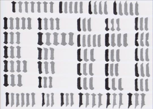
Well over 100 different faces of ‘i’ are depicted (I stopped counting at 100).
IMHO, Needham’s study blows away Zapf’s and any other like theory about Gutenberg’s artisanal precision. It just strains credulity to think that Gutenberg not only intentionally crafted a hundred variants of a letter, but also then took the time to carefully select a particular letter from that group, all for the sake of alleged “perfect gray space.”


